
It’s no wonder I need a new prescription for my glasses! Having been away from Google Workspace for over a year experimenting and learning Microsoft 365 Business Premium (and beyond), I return to Gmail and find that the “normal” font they use is far too small for me to read comfortably.
Both at home and work I use BenQ monitors that support 1440p resolution. Long gone are the days of 1920×1028 (HD) and lower resolutions – though they still exist. Gmail’s problem is that the composition interface hasn’t been updated in over a decade (or more) and while it accommodates the lowest common denominator, it’s not good enough for those running on higher resolution displays. I found the “large” font to be too large.
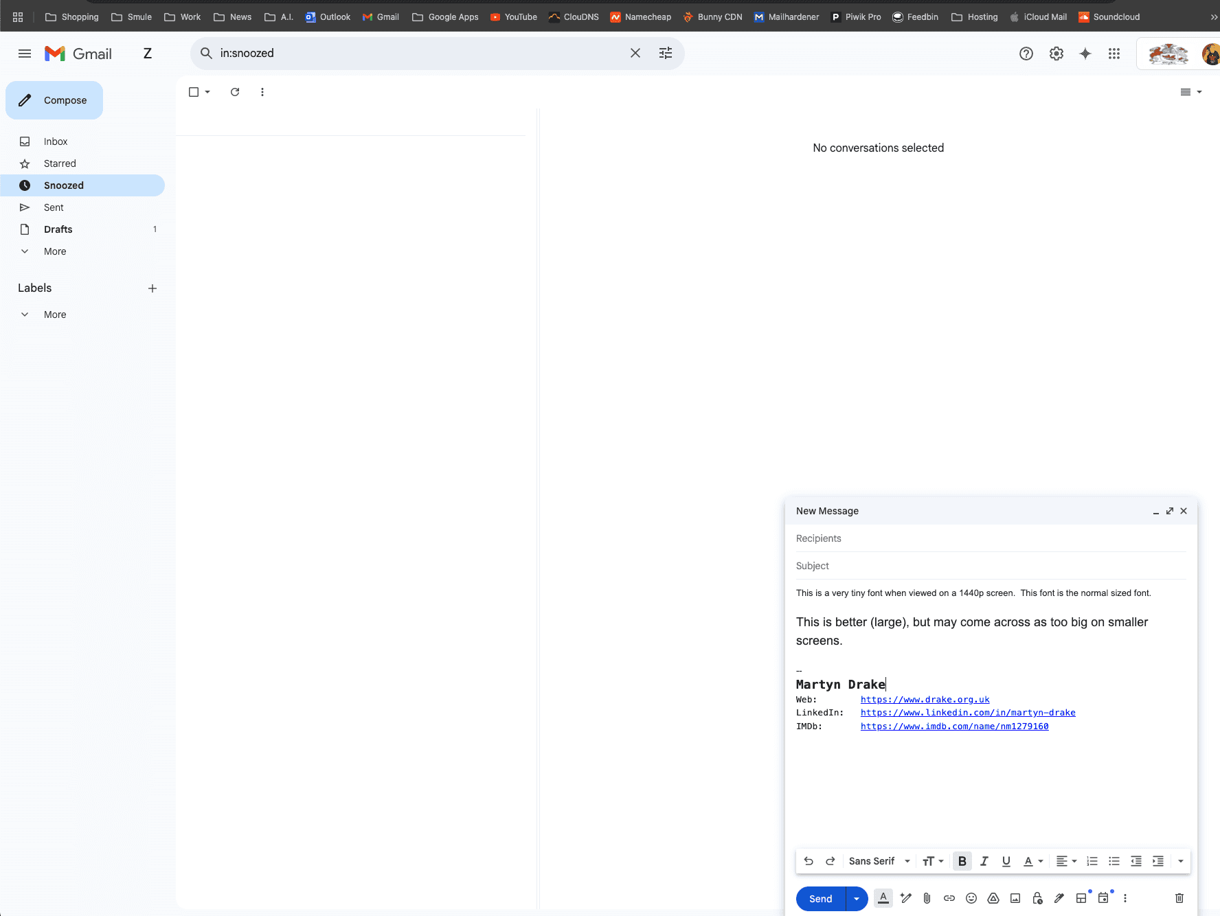
For example, here’s an example of a message sent from a Gmail account to me – this is the normal size font:

And this is what it looks like when I go to compose. Look at that screen estate and how teeny weeny the normal size composition font is to the rest of the user interface. Using the next size up makes it look as if I am blind and looks too big even on a 1440p display. 16px should be the minimum for most web sites, so as email is now practically all HTML, surely that needs to change too?
So, it’d be appreciated, Google, if you could revisit Gmail’s composition fonts and bring the whole thing into the next 25 years of this century so that everybody is able to comfortably read email sent from Gmail. As a workaround, I use the V7 Gmail Zoom Chrome extension to resize the reading font and composition font – but it’ll send everything with the normal size font. I could also just use CTRL-+ to zoom in, but that makes the rest of the UI too big.
Outlook for web doesn’t have this problem, BTW, because it’s easy to specify the exact size font (along with a greater selection of font families) and has chosen a sensible size by default. Points to Microsoft!